

Markets surge as Trump triumphs in US elections


Welcome to Aftermarket Report, a newsletter where we do a quick daily wrap-up of what happened in the markets—both in India and globally.
Market Overview
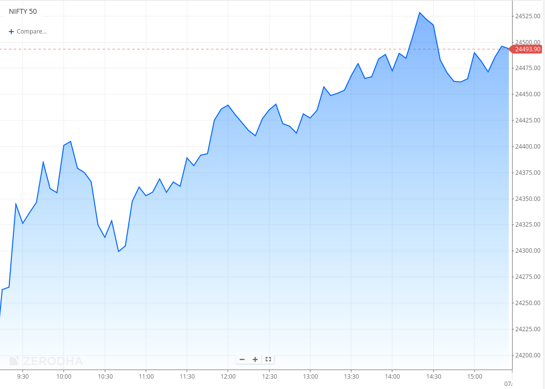
After a volatile start, the Nifty gained momentum, crossing 24,500 and closing up 1.11% at 24,484.05. Market breadth was strong, with 2,213 stocks advancing and 620 declining on the NSE. The rally was largely driven by record highs in U.S. stock futures following Donald Trump's election victory.


Tijori is an investment research platform, and they have constructed niche indices for various themes and sub-sectors. They help you get a sense of the market performance of narrow slices of the market.


What’s happening in India
Waaree Energies market cap crosses Rs. 1 lakh crore
What happened:
Shares of newly listed Waaree Energies climbed by 7.6% on Wednesday, reaching a new high of Rs 3,740.75 on the BSE before closing higher by 4.55% at Rs 3,633.65.
This pushed the company's market capitalization beyond the Rs 1 lakh crore threshold. Since its debut on October 28 at Rs 2,550 — a 69.7% premium over its IPO issue price of Rs 1,503 — the stock has gained around 49% in a week.
Why?
Strong growth in the solar sector is backed by government incentives like the PLI scheme.
FY24 revenue increased by 69% to ₹11,398 crore.
Profit after tax doubled to ₹1,274 crore in FY24.
Expansion plans include a 3 GW manufacturing facility in the US.
Increasing demand for solar energy solutions globally.
Source: Economic Times
Hindustan Zinc shares drop after government announces stake sale
What happened:
Hindustan Zinc Ltd.'s stock fell by up to 8.31% following an announcement from the Ministry of Mines about selling up to 2.5% of its stake in the company via an offer for sale (OFS). The OFS will open on Nov. 6 for non-retail investors and Nov. 7 for retail investors, with a floor price set at Rs 505 per share, a 9.8% discount to the last close.
Why?
As the promoter of Hindustan Zinc, the Indian government intends to sell up to 5.28 crore equity shares. The sale includes an initial 1.25% stake, with the option to extend by another 1.25% if there is excess demand, according to the company’s filing.
Source: NDTV Profit
RBI plans to expand rupee vostro accounts
The Reserve Bank of India is looking to expand the use of rupee vostro accounts, potentially allowing cross-border lending and loans to Non-Resident Indians (NRIs). A new framework might be rolled out in the next six months.
What are Rupee Vostro accounts?
Think of them as special accounts foreign banks hold with Indian banks. They’re used to settle payments in rupees, making it easier for traders and investors to deal with India without needing dollars or other foreign currencies.
Why is the RBI doing this?
The RBI wants to promote the rupee in global trade by expanding the use of rupee Vostro accounts. This encourages foreign institutions and NRIs to transact more in rupees, reducing dependency on the dollar. If successful, this could lower trade costs and improve the rupee’s usage in international transactions.
India's services sector growth accelerates in October

Source: Trading Economics
What happened:
Growth in India's services sector accelerated in October, with the Purchasing Managers’ Index (PMI) climbing to 58.5 from September's 57.7, marking an increase in demand both domestically and internationally. The PMI has consistently remained above the neutral 50-mark, indicating expansion, for the last 39 months.
Why?
The improvement was driven by robust customer demand both within India and abroad. New export sales grew across various regions, with clients from Africa, Asia, the Americas, the Middle East, and the United Kingdom contributing to the expansion. This demand uptick also led to increased job creation within the sector.
Source: Business Standard
India’s IT hardware push
Starting January 2025, India plans to introduce stricter import restrictions for laptops, PCs, and other IT hardware. The new rules may require prior approvals for imports and set minimum quality standards for devices. This follows earlier restrictions in 2023, which had minimal impact on reducing imports, as nearly 60% of India’s IT hardware is still sourced from abroad, primarily China.
Why does it matter?
The government wants more IT hardware made in India, like it did with smartphones. This could bring more business for local manufacturers and attract big companies to set up factories here.
Source: Finshots
Rosa Power achieves zero-debt status
What happened?
Rosa Power Supply Company Limited (Rosa Power), a subsidiary of Reliance Power, prepaid a loan of ₹485 crore to Singapore-based lender Varde Partners, achieving a zero-debt status. In total, Rosa Power has settled ₹1,318 crore of debt ahead of schedule, having previously prepaid ₹833 crore in September.
What it means to the company
This move strengthens Rosa Power's balance sheet and aligns with Reliance Power’s strategy to enhance its financial health. The recent ₹1,525 crore equity-linked preferential issue further positions Reliance Power to seize opportunities in the rapidly expanding clean and renewable energy sector.
Quarterly results
In this section, we'll dive into all the key highlights from today's intriguing results, covering the most impactful performances and standout moments. The numbers are comparable on a year-on-year (YoY) basis.
PB Fintech (+1.30%)

What happened:
PB Fintech reported a net profit of ₹51 crore in Q2 FY25
Revenue grew 44% YoY to ₹1,167 crore
Adjusted EBITDA margin improved from -26% to -12%.
Why?
Increased demand in the under-penetrated insurance sector boosted core insurance revenue by 41% YoY.
Adjusted EBITDA margin improved by 14 percentage points due to better operating leverage.
Apollo Hospital (0.03%)

What happened:
Q2 profit rose 59% YoY to ₹395.70 crore
Revenue increased 15.3% YoY to ₹5,589.30 crore
EBITDA grew 30% YoY, reaching ₹815.5 crore.
Why?
Strategic investments in Apollo Health and Lifestyle and new multi-specialty hospitals expanded access to healthcare.
Partnership with the Tripura Government for free heart surgeries for children reinforced community-focused initiatives.
Innovations like water vapor thermotherapy for prostate care and robotic radiosurgery for cancer enhanced advanced treatment offerings.
Akasa Air reports higher loss
What happened:
Akasa Air reported a loss of Rs. 1,670 crore for FY24, up from Rs. 744 crore the previous year. Its income grew to Rs. 3,144 crore, supported by an expanded fleet of 24 planes, over 110 daily flights, and the launch of international operations in March 2024.
Why the loss?
The losses are attributed to high initial investments in fleet expansion, infrastructure, and training. Operating costs increased significantly as the airline focused on growth.
Comments from CFO
The CFO explained that early losses are normal for a growing airline and emphasized being “net cash positive.” Optimistic about the future, he highlighted plans to reduce costs, boost revenue, and expand internationally to work toward profitability.
What’s happening globally
Markets surge as Donald Trump triumphs

How are various markets reacting?
Global financial markets have reacted strongly to Donald Trump’s victory in the 2024 US Presidential elections.
US Markets: The Dow Jones has jumped by 1,150 points (2.7%), while the S&P 500 and Nasdaq indices have risen between 1.9% and 2.3%. The Russell 2000 Index, tracking small-cap U.S. stocks, surged by a massive 6%, reflecting optimism in the domestic economy and smaller companies.
Global Markets: European and Indian markets have climbed nearly 1%. Asian markets, however, showed mixed reactions—Japan’s markets rallied with a 2.7% gain, while Hong Kong’s Hang Seng Index and Chinese markets closed lower by 1.5% to 2% as Investors worry that his policies, like higher tariffs on Chinese goods, could impact trade and key industries. In China, investors are waiting for updates on new stimulus measures from the National People’s Congress meeting.
Cryptocurrencies: The crypto sector continued its bullish momentum, with Bitcoin surpassing the $75,000 mark for the first time.

Bonds and Currency: U.S. 10-year Treasury bond yields have risen by 3.27%, while the U.S. Dollar Index is up 1.5%, nearing the 105 level. China’s yuan dropped over 0.8% against the dollar on Wednesday. The CSI300 Index fell 0.27%, and Hong Kong’s Hang Seng dropped 2.5%. Tech companies like JD.com and Alibaba saw significant losses.
Individual Stocks: Tesla's shares are up 13% in pre-market trading, boosted by Elon Musk's public support of Trump during the campaign. In his victory speech, Trump praised Musk, stating, “We have a new star. A star is born: Elon."

Management chatter
In this section, we pick out interesting comments made by the management of major companies.
Robbie Singh, CFO, Adani Enterprises on entry into the AI supply chain
Not the AI supply chain, but we have two large service businesses within AEL, which is our Adani Digital Labs and our Global Capability Center. The digital infrastructure rollout and consequent development of smart systems across those two businesses is a big drive internally for us. We don't report them separately at the moment because they are emerging businesses.
Our focus in the first phase over the next five years is to focus on the incubation of airports, green hydrogen, and the roads business plus data center. As we go through this development phase of our services i.e. digital infrastructure services businesses, we will be outlining them in more detail. But I expect that currently, it's more of an R&D type of expenditure investment. We expect to provide full briefings on the development of services businesses in a meaningful way probably towards the end of this decade when they reach a certain scale. - Link
CK Venkataraman, MD, Titan Company Ltd. on lab-grown diamonds
Actually, while the potential of the LGDs to become a serious substitute for the naturals in India is very much there, the evidence of that actually is yet to be seen. Our own understanding of the relatively lower growth in diamond jewelry is not really because of lab-grown diamonds, but because of overall, on the one hand, the consumer perceptions relating to natural diamonds’ continuing value, especially at the very high prices, as well as some of our own doing, if I can say, some gaps in our product strategy in certain price bands, which we have actually fixed in the interim. So while LGD is an important strategic item in our thoughts and in our considerations, it is not a call-out at the moment impacting our diamond jewelry business. - Link
Mohit Malhotra, CEO, Dabur India on Urban Demand and Food Inflation
As far as urban demand goes, it appears to have bottomed out. Last year at this time, urban demand was growing at 11%, but it has now slowed to 2.8%. I don’t expect urban demand to decline further. The last time urban demand dropped was during the COVID period, when it fell to around -2% to -3%.
Currently, 2.8% is the lowest level of demand I’ve seen since then. Looking at the data sequentially, urban volumes have grown from 2.1% in Quarter 1 to 2.8%. In comparison, urban demand in Quarter 3 last year was 7.7%, so the base effect plays a role here. I anticipate urban demand to stabilize and gradually rise alongside rural demand, which has also shown resilience.
Regarding food inflation, it remains high. Among all FMCG segments, food is leading growth due to higher prices, including both staples and non-staples. Meanwhile, categories like Home Care, OTC, and Personal Care have mostly stayed flat. With urban demand stabilizing, we might see some growth in discretionary spending. Additionally, higher acreage and increased minimum support prices (MSPs) should help moderate food inflation. The government has already signaled measures to address rising food costs, so we can expect further actions to control it. - Link
Calendars
In the coming days, We have the following quarterly results and other major events:


That’s it from us. Do let us know your feedback in the comments and share it with your friends to spread the word.
We’re now on Telegram, follow us for interesting updates on what’s happening in the world of business and finance. Join the conversation on today’s market action here.
Feedback: Quarterly Results section. The charts included are confusing vs the headline. Visually, the chart directions are often in contrast with the headline. Example, PB Fintech +1.3% in the headline, and -1.47% in the chart. Apollo Hospital 0.03% in the headline, and clearly negative in the chart. This is likely because the headline is vs previous close, and the chart is maybe vs open price and the snapshot captured is not correctly reflecting the change.